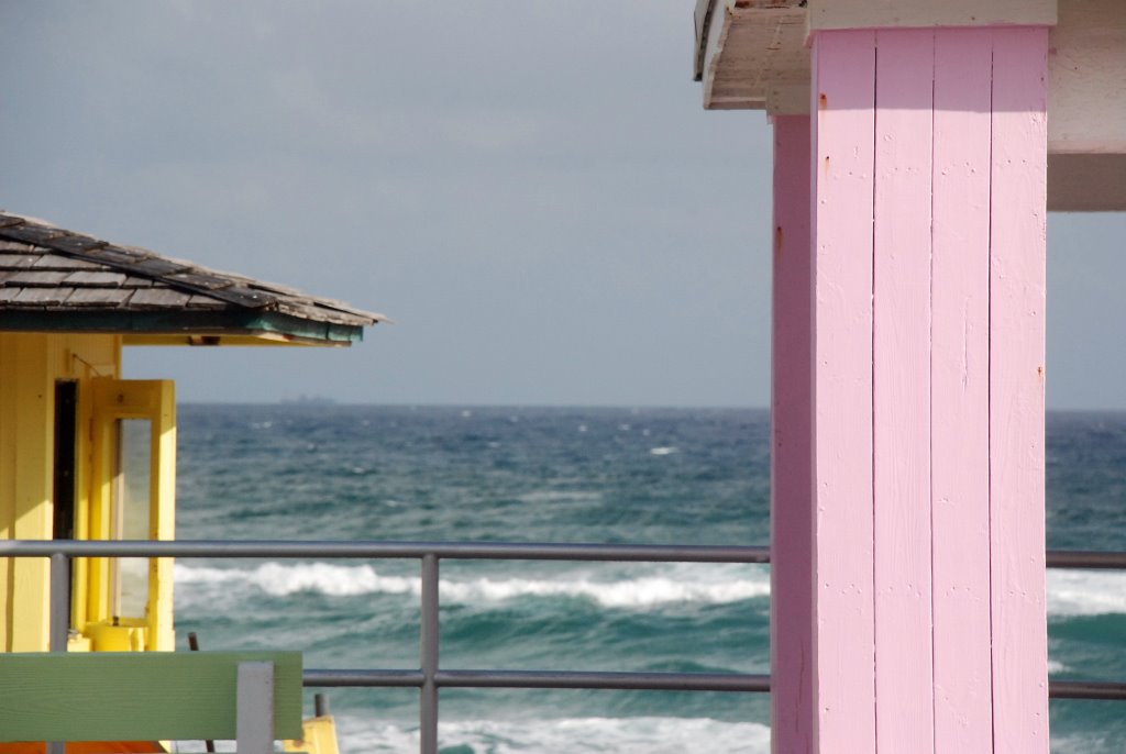
Beachside geometry
Lake Worth, Florida, December 2006 [Click to see the big boat]
I almost didn't take this picture. While having lunch in a crustily old, tiny and charming pizza restaurant across the street from the beach, I realized our two-hour-limit parking meter was about to run out. As I headed out the door, pocket jingling with change, I grabbed my camera bag. My wife told me to come back quickly. She knows me too well.
As I walked out the door, I caught this glimpse of pink and yellow and thought how utterly Florida this was. The colors simply couldn't exist anywhere else. But I couldn't dawdle. So I kept going. I filled the meter and walked back. The colors were still there, beckoning me to take a picture. And since it would gnaw at my gut if I left the scene uncaptured, I decided to take the shot. But I couldn't waste any time. So I captured the scene without giving it too much thought: align the elements, confirm exposure, focus and click.
It ended up being one of my favorite pictures from the entire vacation. I'm not sure if it's the color, the geometry, the light, I don't know. Whatever it is, it reminds me of an interesting moment during an interesting vacation with my family.
Your turn: Can you figure out what makes this picture work? Does it work for you? What would you call this image if you had to name it?
it's perfect, Carmi. i love the balance of the pink and yellow with the blue of the sky and the green of the sea.
ReplyDeletemichele sent me again.
This definitely works for me...maybe it is the colors. I also like that the point of interests in the photo are staggered...almost 3 dimensional. I am not sure but it is quite pleasing.
ReplyDeleteVacation Hues, Beach Shades...I think I would have think a bit about a title. I have one similiar to this of a restaurant in Destin FL on the beach and all the windows were different colors. It is one of my favs as well.
Another nice pic Carmi!
This has a real Edward Hopper feeling to it, Carmi, a nice juxtaposition of buildings, water and colors.
ReplyDeleteI like that there are so many straight lines and 90 degree angles. It is a little different than what one would expect of a 'beach' picture. That makes it interesting! Of course, the colors are great as well.
ReplyDeleteMichele sent me!
I like the green color in the bottom left corner. Michele sent me back, Carmi.
ReplyDeleteHi Carmi
ReplyDeleteI'd call it "Playtime by the Sea", what a beautiful pic, the colors are marvelous. Sorry I haven't been around
Here in the southeast US, people are so drawn coastal towns with pastel buildings (Charleston is another example). I think we're all hungry for color. Makes you wonder why more exteriors aren't colorful like those.
ReplyDeleteI love it....a splash of color! For me, most of the time when I see it I know it. And I've disciplined myself more lately NOT to second guess myself. Because, like you said you tend to never forget the image and the missed opportunity. I came via michele's.
ReplyDeleteGreat photo, Carmi. Stopping by via Michele's. Hope all is well.
ReplyDeletehi there
ReplyDeleteThe lines and the two buildings draw you to the ocean in the middle.....it gives it depth.
I love the floridian colours too. The colours found on the houses in the Maritimes are often an interesting mix......colours you never see anywhere else either. It animates the downtown area.......i love it.
Michele sent me again.
ReplyDeleteI would call this "Ticky Tacky Houses" from an old song I heard on the radio as a kid called "Little Boxes" by Malvina Reynolds
Little boxes on the hillside, Little boxes made of ticky tacky
Little boxes on the hillside, little boxes all the same
There's a green one and a pink one and a blue one and a yellow one
And they're all made out of ticky tacky and they all look just the same.
There are more verses here.
It reminds me of lemonade. And a little of bubble gum. And how when it was 70 degrees in Jersey last weekend, I wanted some lemonade bad.
ReplyDeleteANOTHER great Carmi photo! I like to composition and the colors.
ReplyDeleteA wonderful use of colour there, Carmi.
ReplyDeleteMichele sent me here.
For me, it's a combination of ALL those elements you mentioned, but, particularly The Colors!
ReplyDeleteWONDERFUL picture Carmi...!
I am always drawn to bright colors so I LOVE this picture. Isn't it cool that what might be considered "gawdy" in other parts of the world is "everyday" in Florida?
ReplyDeleteWhat works for me is the backdrop of the natural sky and water to the straight lines of the bright man made huts. The yello and pink frame the shot and positively glow in the light.
ReplyDeleteI would simply title it Sea View, because that is what it is.
Here from Micheles,
ReplyDeleteI like the picture, Florida is an odd place, it's true, the colors used there are a little off the wall, The wave you caught in the frame is so pretty, makes me long for the beach though I was just there in December...
Love this one, Carmi. The colors are muted and beautiful... the open door lends some mystery to the image.
ReplyDeleteHere by way of michele!
What I like is the stark hard lines of the pink against the almost fuzzy mishmash of the sea. Also the completely man-made hues of pink and green against the completely nature-made color of the sea. The juxtapostions work to keep the viewer entranced.
ReplyDeleteI just LOVE the colors in this photo. And you're right....perfect pastels for Florida.
ReplyDeleteA name that came to mind was "Bubblegum & Lemons."
for me, its the depth of field, how one object is layered over the others,drawing you further and further into the picture, then out onto the waves and then just when you think its all gone fuzzy ( like my old eyes) you see the freighter on the horizon.
ReplyDeleteIt looks like an oil painting