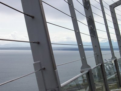
Nothing much to say on this one. I just loved the view.
Some people would think the view should be photographed without interference from foreground elements. I'd like to think that the barrier made an interesting picture even more fun to explore. Vive la difference photographique.
Your turn: What goes through your mind as you take in this image?


27 comments:
I like it.
Its been a long while since visiting you. Nice to *see* you again.
My first thought was that it looks like something they don't want me to jump off of. Michele sent me.
Great composition. With all the greys, I suspect this would also be a good mono shot. Where is it? Elliott Bay?
rashbre
where was this picture taken? Oh its beautiful!!! First thing that comes to mind is freedom.
I agree; the barrier makes the whole shot more interesting.
Michele sent me here.
i like it too, although it would probably be nicer to have an unobtructed view. good way to stop them bungee-jumpers, though - lol!
The foreground elements give depth and scale to an otherwise boring landscape, Carmi. I like the parallel lines too. It gives a sense of stability even though it is of a boat/ship/ferry on the water.
Michele sent me this time.
What do I think?
hmm.....
I think I would love to go swimming there, it looks so peaceful.....
of course, you'll probably tell me now the water is like 20 below.....
:-)
cq
Michele sent me, Carmi.
I definitely agree with you, Carmi. I often include foreground detail to make photos more interesting. Especially when taking pictures of large monotopics like lakes, oceans, fields of grass, et cetera. Often what looks great to the eye--like a large body of water--just looks boring in a picture. Foreground detail solves that if you do it right. And you do!
I also like detail of everyday metal objects. That came up a week or so ago when you published a photo you took of a fire hydrant, and quite some time ago when you did a street grate, or maybe it was a manhole cover.
that I am deathly afraid of heights and you were much closer than I would be. That's what zooms are for! LOL
Michele sent me.
It looks like a thought provoking juxtaposition of nature vs. the influence of man. Very nice.
I love the tilt. A great view from an interesting angle. Maybe I'm thinking about the time I got seasick on a glass bottom boat.
That looks like half the pictures I got going across the Macinac bridge last summer!!
I LOVE pictures like that!
Stopping by via Michele this afternoon to say Hello!
...that I live in a town called Vista?
Beautiful shot, Carmi... :)
Here via michele!
Vista...I like the double signifigance of the title.
I'm afraid of heights too... its a beautiful shot.
jeremy
My photography centers around depth and color, I have a ways to go though.
this is a wonderful shot carmi. excellent composition and tone.
makes me feel like there's a whole big wide world out there and I'm caged in.
I love your photos
Love the picture and I agree the barrier adds dimension. It looks chilly though, so I want to reach for my sweater, and then my camera.
Here from Michele
I think of a time when I went to Seattle.....and I love the stuff in the foreground...very cool shot.
It's soothing and tranquil. Looks rainy...again...reminds me of Seattle....I really need to go back.
I like the composition and the wires add to it... giving you pause to think if it's a bridge or the bow of the ship, are they there for structural support or to keep people from going overboard. Good photo.
Reminds me of being on a boat.
I looked at the picture first and I thought, "huh. I never thought to take a picture of the view in front of the view!". That's great Carmi. Good framing as well!
Michele sent me, and its overdue. Sorry I haven't visited in so long...
It makes me dizzy.....
But it's a great pic, as always.
Hi Carmi, long time no talk! :)
I love this picture Carmi...and exactly because of the barrier....It's like a metaphor of life...something always in the way and out of reach of Beauty! You know? Wonderful, my dear...!
Couldn't have done this better. You are really a pro in photography aside from being a journalist.
Wish I had the same talent. Looking forward to more work.
Enjoy your week!
OOOOoooooh...I like this...
I like the contrast between the restraint of the barrier and the freedom of the horizon...
and yet, the two are connected with colour...
Does that mean that we cannot have restraint without freedom?
*philosophises*
Post a Comment